
Suveshh Kidswear
Brand Identity | Logo | Brand Collaterals
Year:
2025
Category:
Kidswear
Client:
Suveshh

Suveshh – A Kidswear Identity Built on Love, Play & Handcrafted Warmth
Suveshh is a kidswear brand rooted in affection, protection, and the simple magic of childhood. The brand’s name, handwritten in Hindi by the founder’s guruji, became the emotional nucleus of the identity—an heirloom gesture, carrying blessings, devotion, and a sense of personal lineage. My role was to craft a visual world around this sacred wordmark—one that feels tender, playful, and deeply human.
Building a Visual Language Around Childhood
Children move through the world with curiosity and wonder. We wanted the brand to embody that same sense of unfiltered joy. At the centre sits the essence of childhood: tiny steps, soft shapes, gentle lines, and warm, familiar colours. Every piece of the symbol carries meaning.
– A tiny footprint represents innocence, exploration, and the very first steps a child takes into the world.
– A playful child figure stands for imagination, energy, and the free-spirited nature of early years.
– A heart anchors the system in love—care, affection and emotional safety.
– A nurturing hand reflects the mother’s presence: the support behind every wobble, every dream.
– Soft grassy shapes bring in nature—the kind of safety only the outdoors and a mother’s embrace can create.
– Home-like forms symbolize warmth, comfort, and clothes that feel like a hug.
The Hand-Drawn Soul of the Brand
Kids rarely draw perfect lines, and that’s the beauty of their world. The Suveshh logo embraces that same unpolished charm. Edges are soft, curves are imperfect, and forms feel sketched rather than engineered. This intentional hand-made aesthetic allows the brand to feel approachable and emotionally honest—more like a heartfelt doodle than a corporate mark.
The Hindi wordmark strengthens this authenticity. It isn’t typed or stylized; it’s a direct imprint of sentiment and blessing, making the identity deeply personal and culturally grounded.
Creating a Pattern System Inspired by Children’s Scribbles
To extend the brand beyond the primary logo, I designed a series of repeat patterns featuring friendly, minimal animal faces—bunnies, bears, tigers, and simple smiley characters. These illustrations echo the same line quality as the logo: soft, playful, and intentionally imperfect. The patterns are flexible enough to be used across clothing, packaging, tags, wrapping sheets, and digital collaterals.The illustrations were purposely kept simplified, resembling the spontaneous doodles a child might draw on paper. This approach keeps the brand light, joyful, and instantly relatable for both kids and parents.
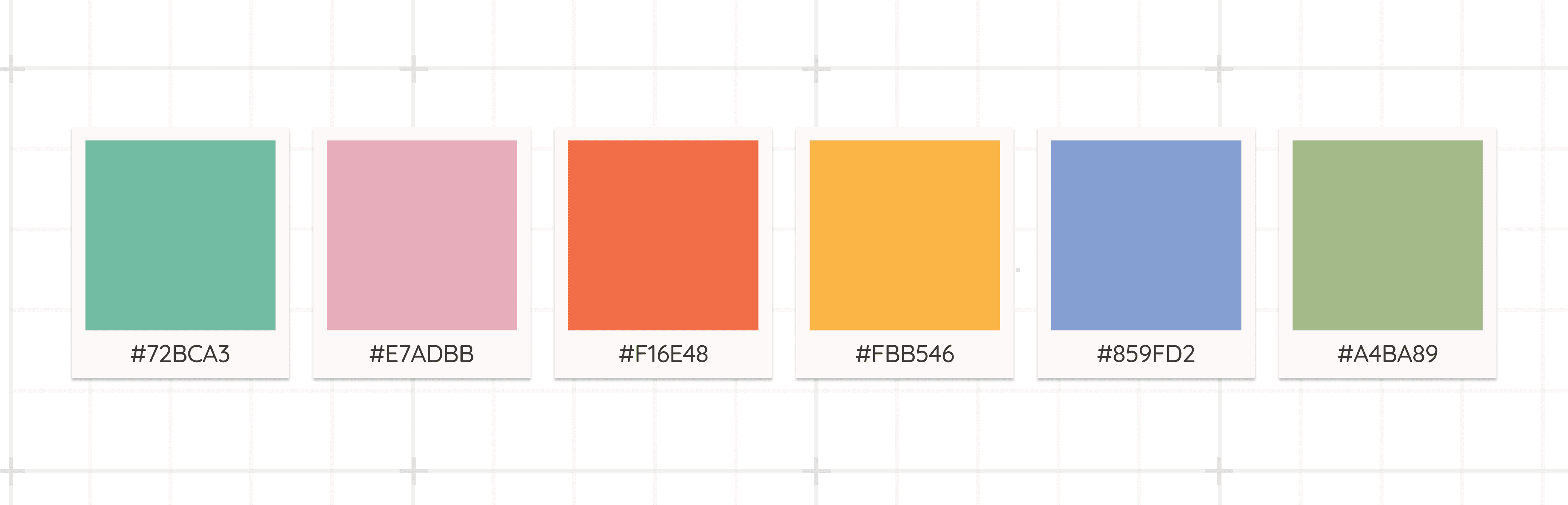
Colour Story
The palette is soft, breathable, and nurturing—much like the clothes themselves. Pastels meet muted brights, evoking safety, nature, gentleness, and warmth. Each colour supports the idea of comfort and childhood innocence rather than hyper-saturated playfulness.
The final identity system feels like a warm embrace. It’s playful without being chaotic, sentimental without being heavy, and handcrafted without losing professionalism. Suveshh now carries an emotional visual signature that reflects its ethos: clothing that protects, comforts, and celebrates the earliest chapters of life.
Design Outcome
The final identity system feels like a warm embrace. It’s playful without being chaotic, sentimental without being heavy, and handcrafted without losing professionalism. Suveshh now carries an emotional visual signature that reflects its ethos: clothing that protects, comforts, and celebrates the earliest chapters of life.
This project allowed me to merge storytelling, symbolism, illustration, and brand design into a cohesive world—a world where every line has a heartbeat and every shape holds meaning.


Client's Word

Projects
other


