
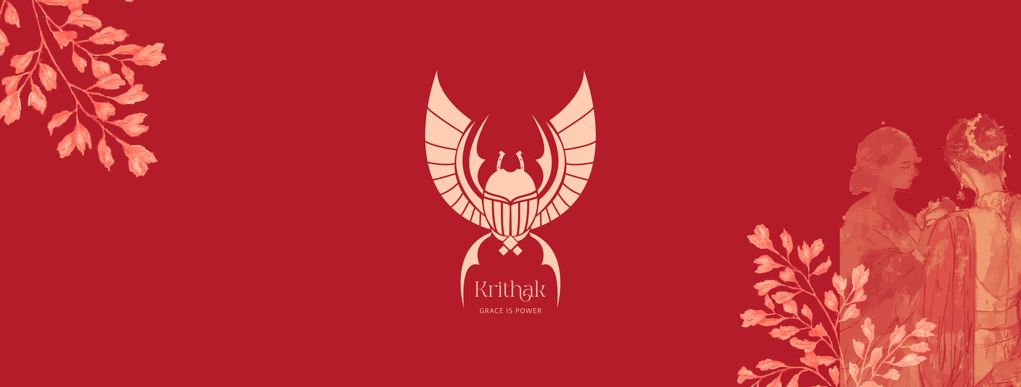
Krithak: Luxury Trousseau wear
Brand Identity | Logo | Brand Collaterals
Year:
2025
Category:
Luxury trousseau wear
Client:
KRITHAK
Krithak: A language of grace, strength, and intentional power
Krithak is a luxury house built on intention, not ornamentation.
Rooted in heritage and inspired by rhythm, it celebrates a form of femininity that is poised, self-directed, and quietly powerful.
At Krithak, grace is not softness; it is control, clarity, and confidence in motion. Each creation draws from symbolism, movement, and form, where elegance carries strength and beauty is shaped by meaning. Every element of the brand is deliberate. From its emblem to its philosophy, Krithak speaks a language of protection, vision, and earned power, where tradition is not repeated, but reinterpreted with intelligence and restraint.
Krithak is for those who move with purpose, hold their ground with dignity, and understand that true luxury is never loud; it is assured.
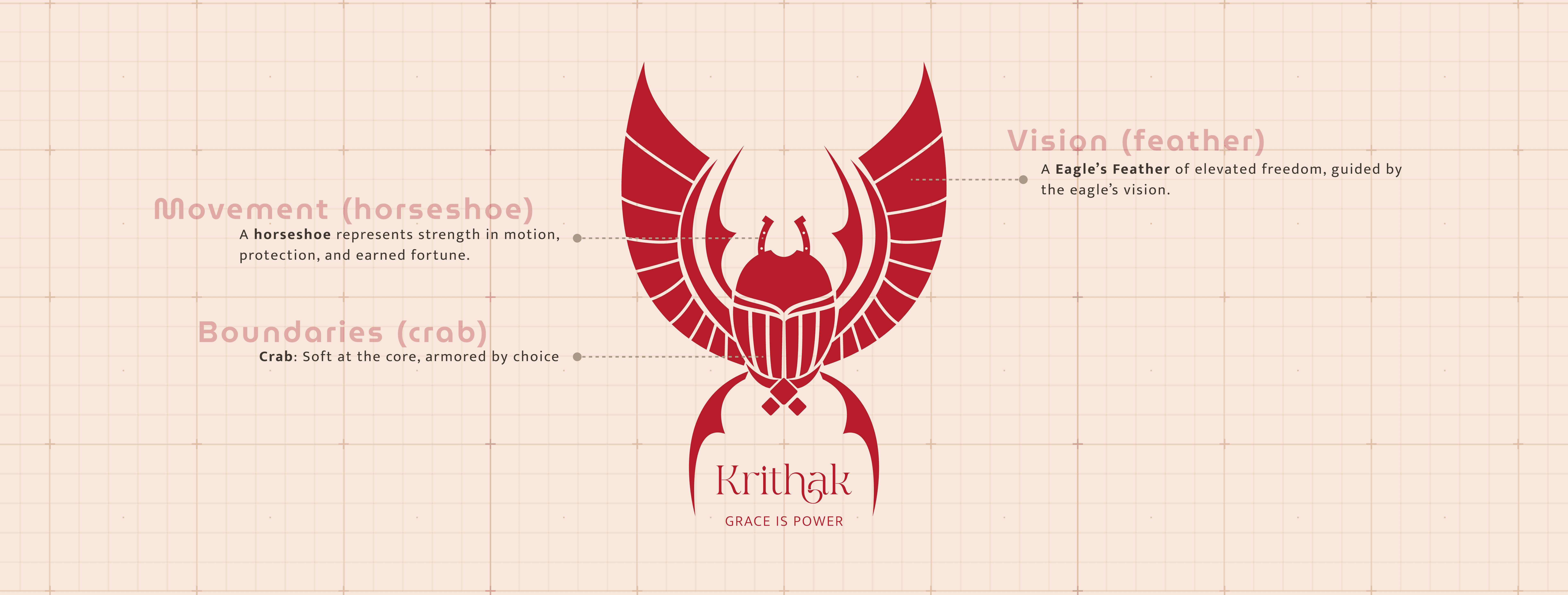
The Quiet Architecture of Power
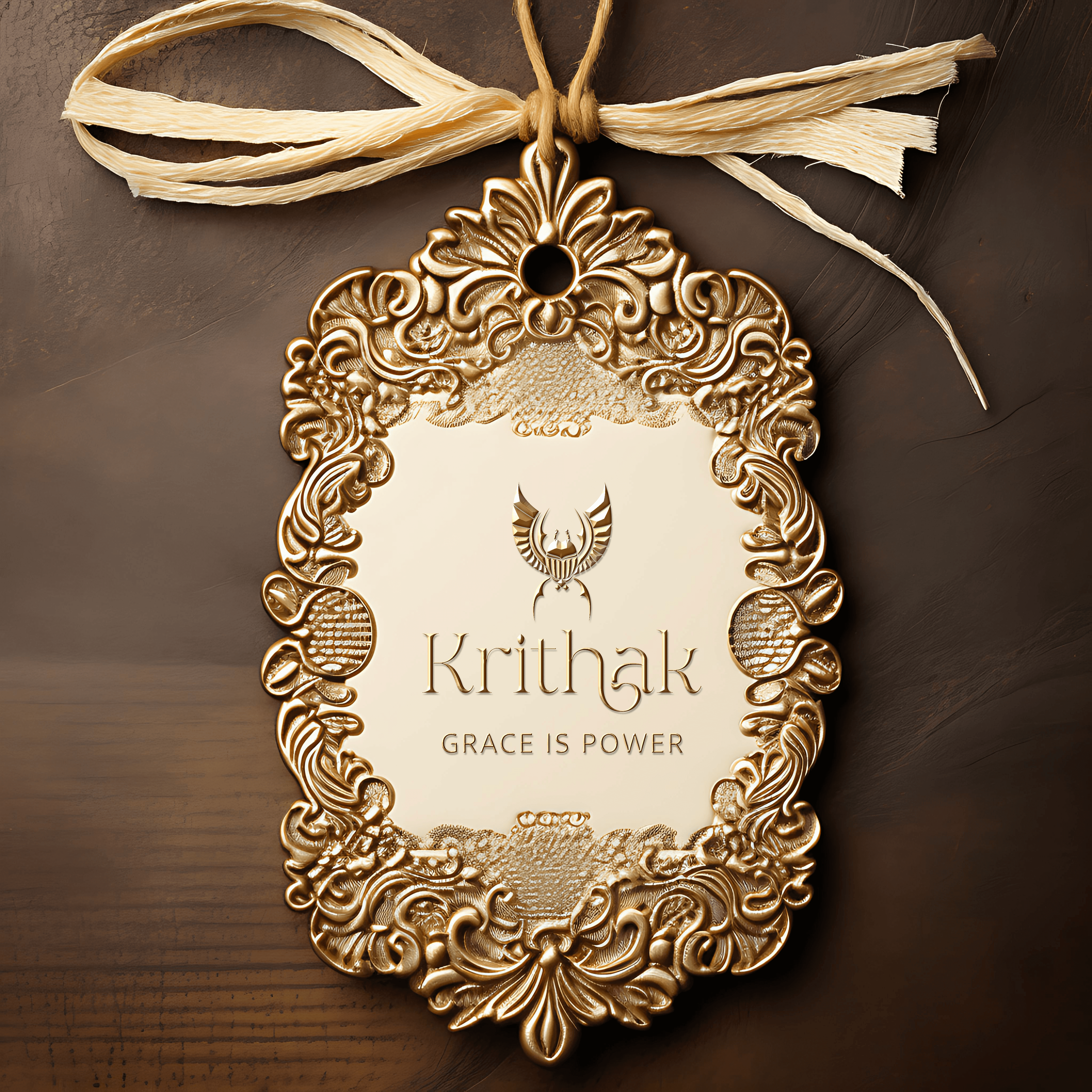
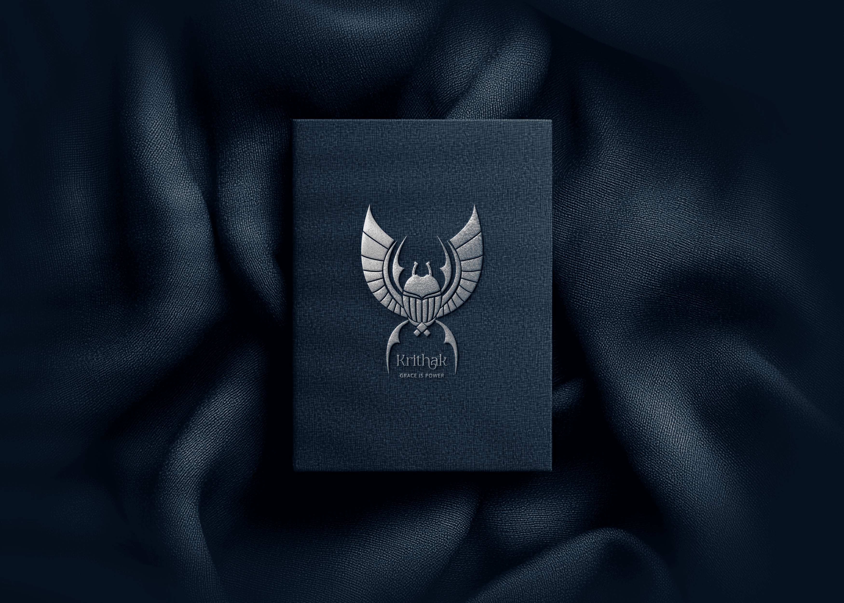
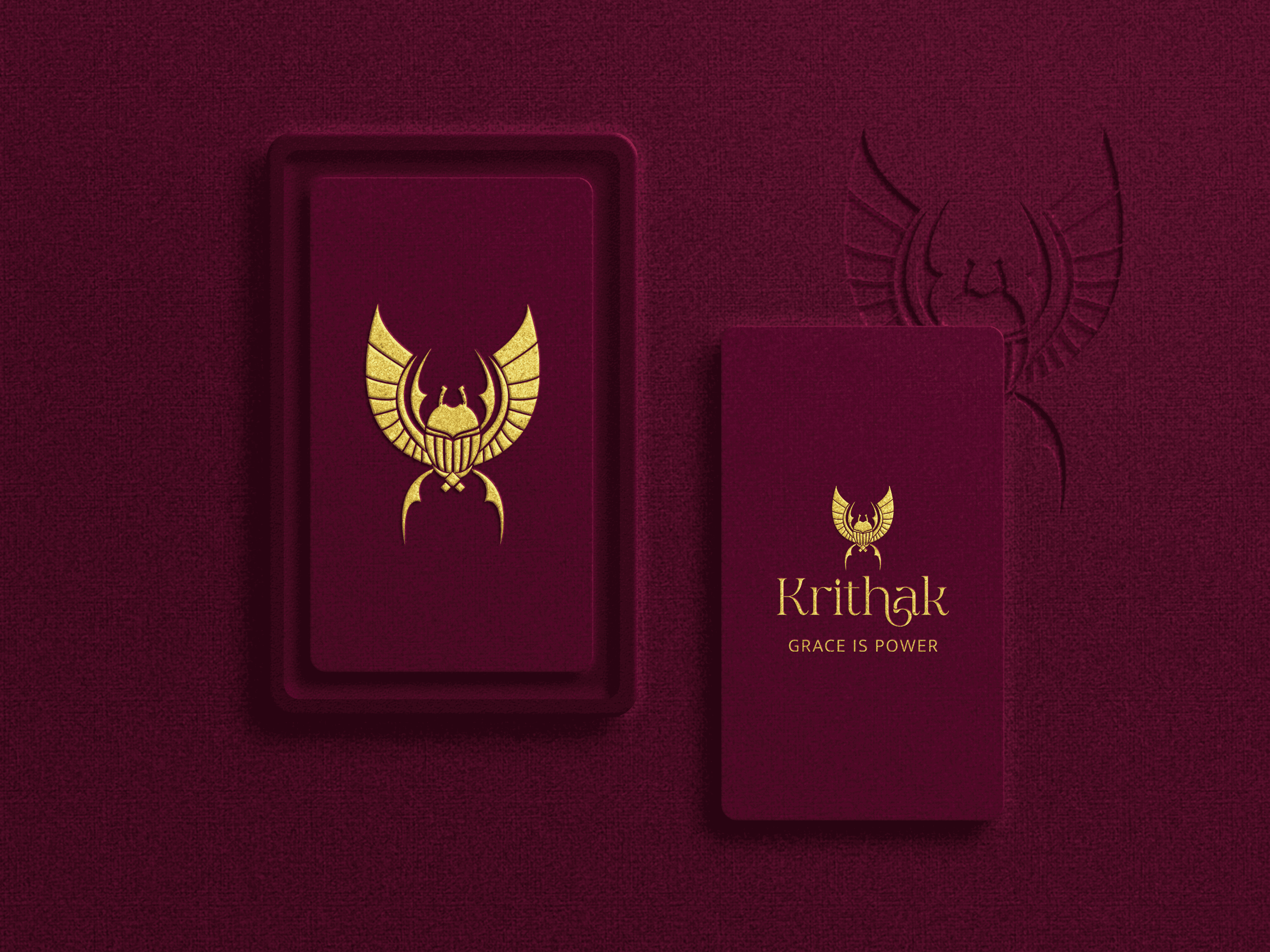
The Krithak emblem is designed as an insignia of intent.
Balanced, structured, and precise, it reflects control over chaos and elegance shaped by discipline. It is not decorative; it is declarative. A symbol of authority, restraint, and quiet power.
The Feather
The feather signifies elevated freedom.
Chosen with the eagle’s feather in mind, it represents vision, fearlessness, and unwavering direction. It reflects movement guided by clarity—light, assured, and deliberate.

The Horseshoe
The horseshoe represents strength in motion.
A symbol of protection, earned fortune, and controlled power, it speaks to progress built through discipline rather than force. Forward movement, grounded and intentional.

The Crab
The crab embodies quiet danger and refined self-preservation.
Soft at the core, armoured by choice, it represents discernment, intuition, and the strength to guard one’s own. Elegance with an edge. Power that does not announce itself.

The Language of Krithak
Together, these elements form a singular language of vision, movement, and boundaries.
Krithak draws power not from excess, but from meaning. Not from noise, but from control. A luxury defined by intention, clarity, and self-possession.

A Language of Structure and Power
Krithak is not built on softness or spontaneity, but on control, clarity, and deliberate form. Its visual language is precise-balanced lines, measured symmetry, and composed structures that reflect strength held in restraint. Nothing is accidental; every curve, every edge carries purpose.
The emblem is designed to feel less like an illustration and more like an insignia, quietly authoritative, grounded, and enduring. It draws from symbolism rather than ornamentation, allowing the brand to communicate power without excess and elegance without fragility.
Krithak’s identity is not expressive in the way of emotion, but in the confidence of self-possession. It speaks through structure, symbolism, and silence, where luxury is not announced, but understood.
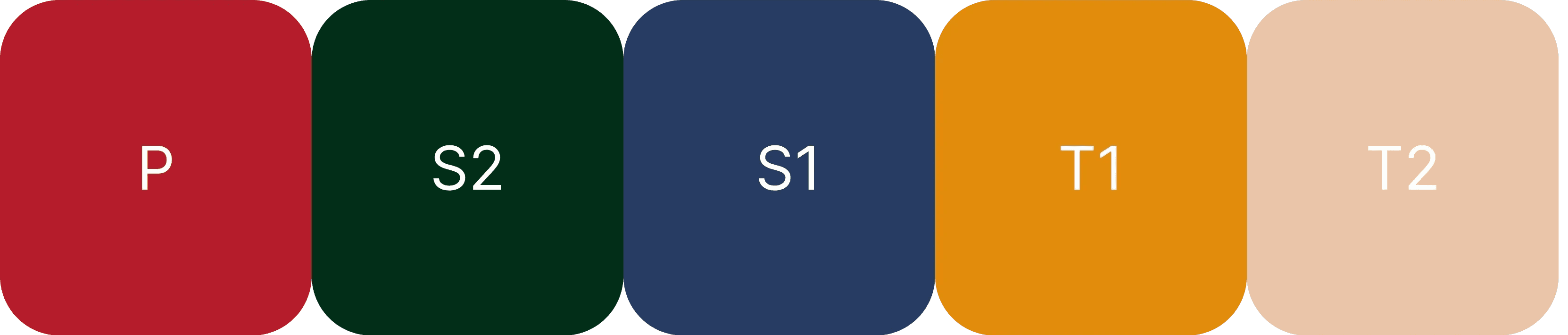
A Palette Rooted in the Indian Soul: Colors
Krithak’s color palette is drawn from lived India, not trends.
From sun-warmed palaces and weathered doors to spice-laden markets, sacred rituals, and shifting seasons, each shade carries the texture of the land.
These colors echo India’s architecture, its climate, its materials, and its rhythm. There is warmth, depth, resilience, and richness - a quiet celebration of heritage with a refined, modern restraint.
There’s a giggle of India in them - familiar, confident, and timeless.
Design Outcome
The final identity for Krithak establishes the brand as a composed, authoritative luxury house rooted in heritage and intention. The outcome moves beyond surface aesthetics to deliver a system where every element carries meaning, restraint, and longevity.
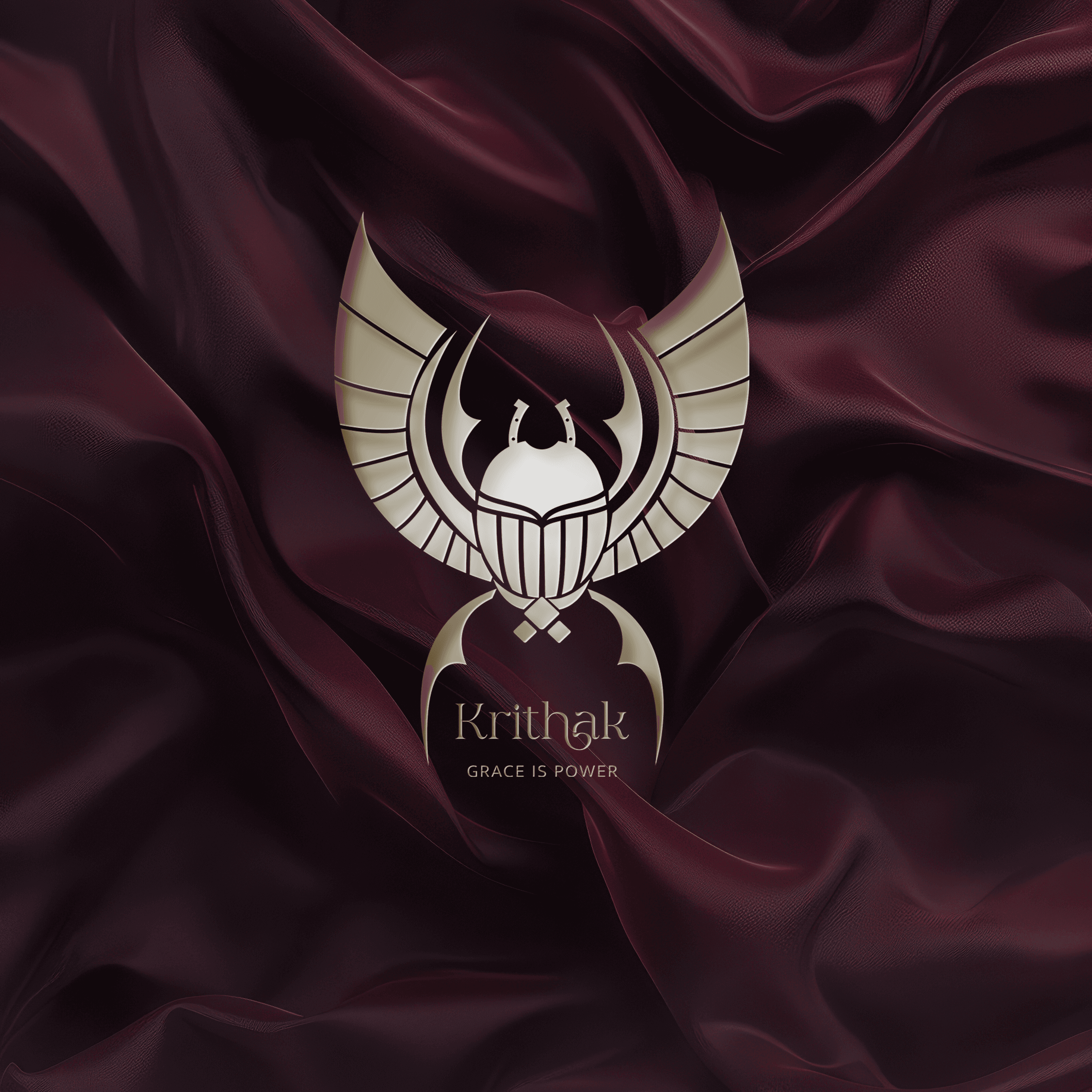
The emblem was developed as an insignia, not an illustration, ensuring high recognisability and adaptability across applications. Its balanced structure and symbolic composition allow it to scale seamlessly from packaging and textile labels to digital and print environments without losing impact.
The color system draws from royal architecture and enduring materials, creating a palette that feels grounded, timeless, and dignified. Each shade reinforces permanence and authority while maintaining visual harmony within the system.
Result
A timeless, symbolic brand identity that is versatile, recognisable, and culturally grounded—designed to endure beyond trends and seasonal shifts.

Client's Word
Projects
other


