
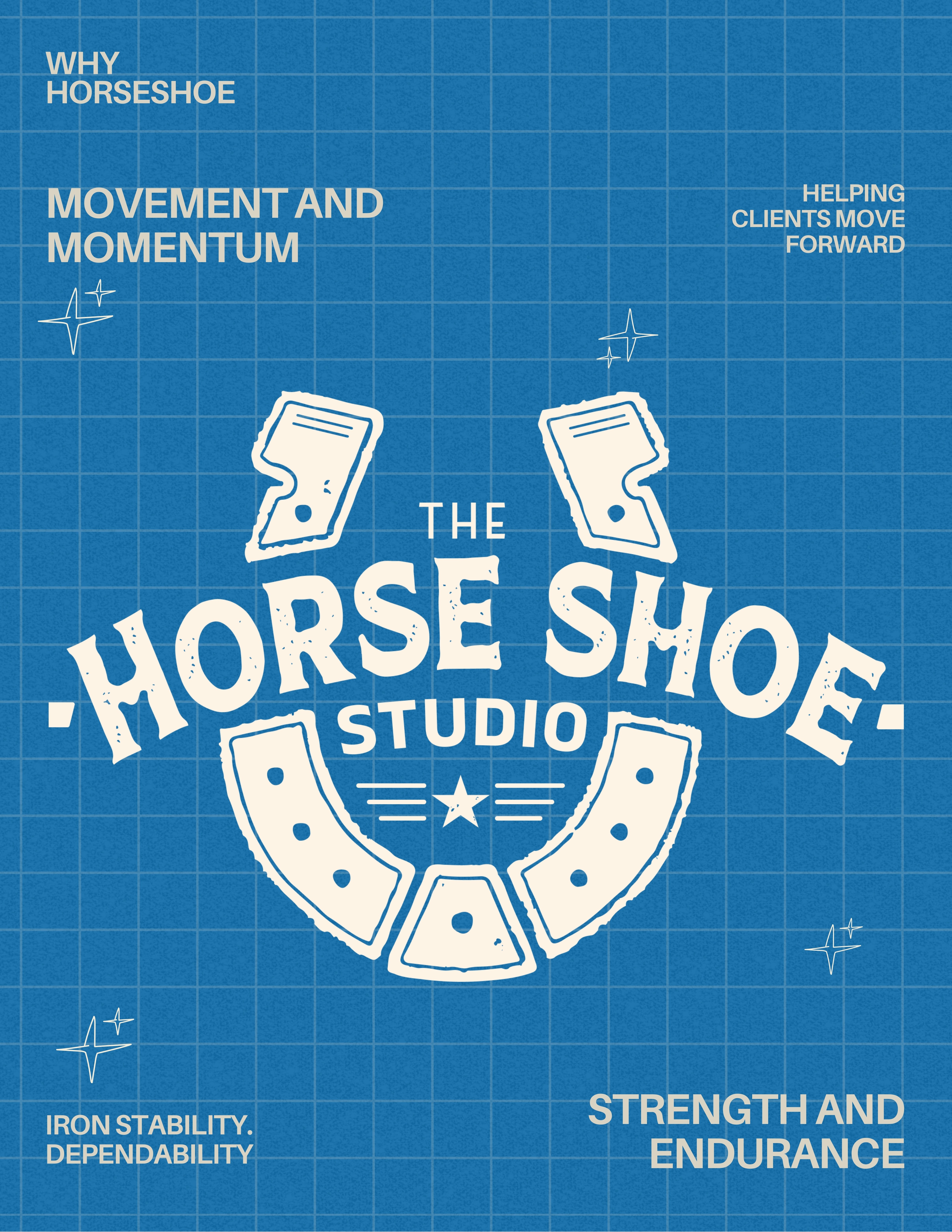
Why the name Horse Shoe
Logo meaning
Dec 15, 2025
Why “The Horse Shoe Studio” — And What Our Logo Really Means
Creative studios often chase names that sound sleek, futuristic, or algorithmically clever. We went in the opposite direction. We chose something forged in fire and hammered into shape by hand: The Horse Shoe.
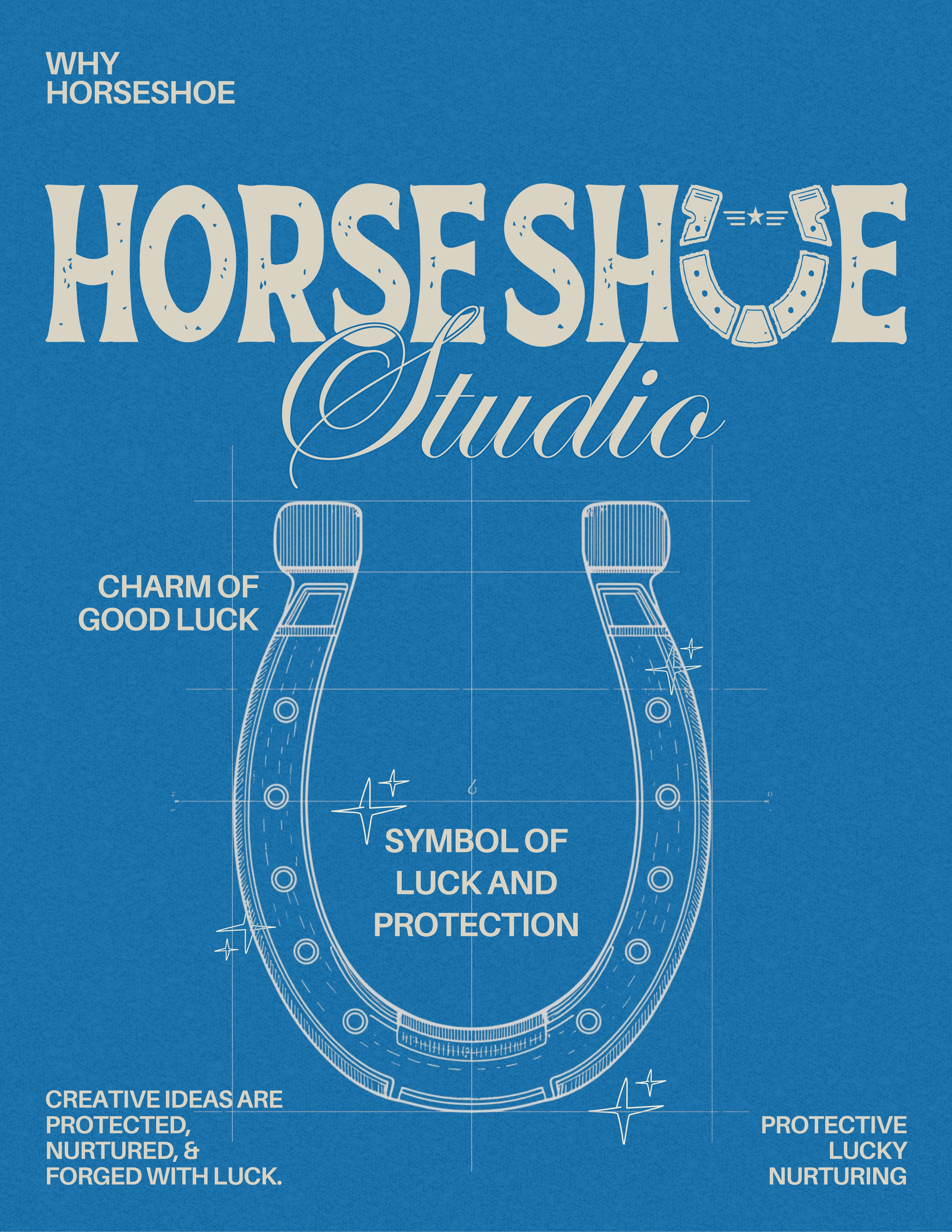
The horseshoe carries a curious duality. It belongs to the world of metal, mud, and movement—and yet, across cultures, it’s treated like a talisman. A crafted object that somehow attracts good fortune, protects spaces, and marks the threshold between the ordinary and the imaginative. That symbolism felt strangely aligned with what we do every day as designers: shape raw ideas, protect their integrity, and guide them into something purposeful.
The name “Horse Shoe Studio” grew out of that intersection of craft and luck. It nods to the grit of making—of hammering away at concepts—and the spark of serendipity that every creative process secretly depends on. Design is never just skill; there’s always a moment of unexpected alignment, a little cosmic wink. The horseshoe already understood that long before we did.
What Our Logo Symbolizes
Our logo leans fully into that mythology, but with a contemporary twist.
1. The Horse Shoe as Protection & Fortune
The central horseshoe is more than décor. It’s the studio’s shield. Historically, people placed horseshoes above doors to guard their homes and invite prosperity. Here, it represents a creative space where ideas are protected, nurtured, and given room to grow.
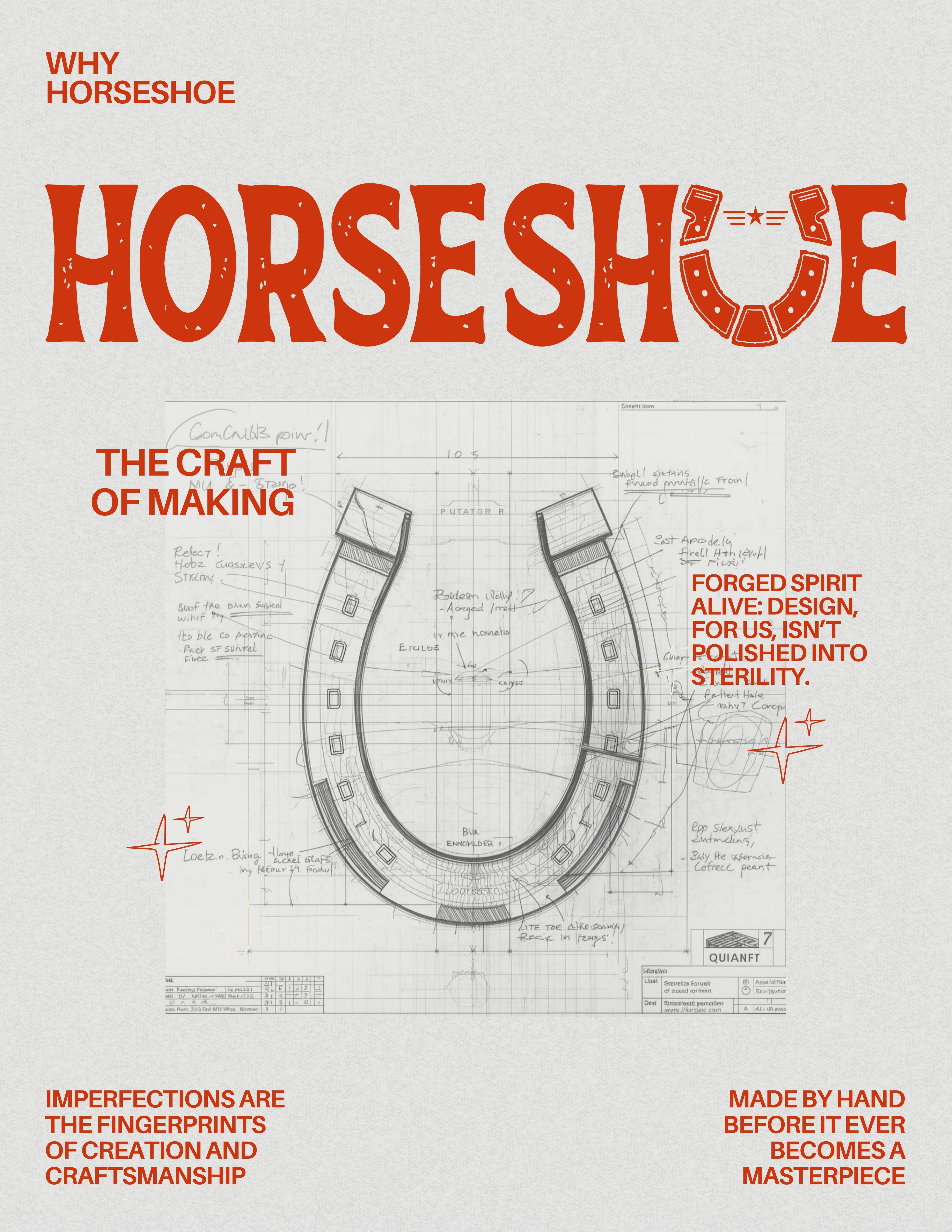
2. The Craft of Making
The texture, the rough edges, the illustrated rivets—they echo the hammer-and-anvil origins of a real horseshoe. It hints at the studio’s hands-on attitude: design shouldn’t look lab-sterile; it should feel alive. Imperfections add personality. They prove the maker exists.
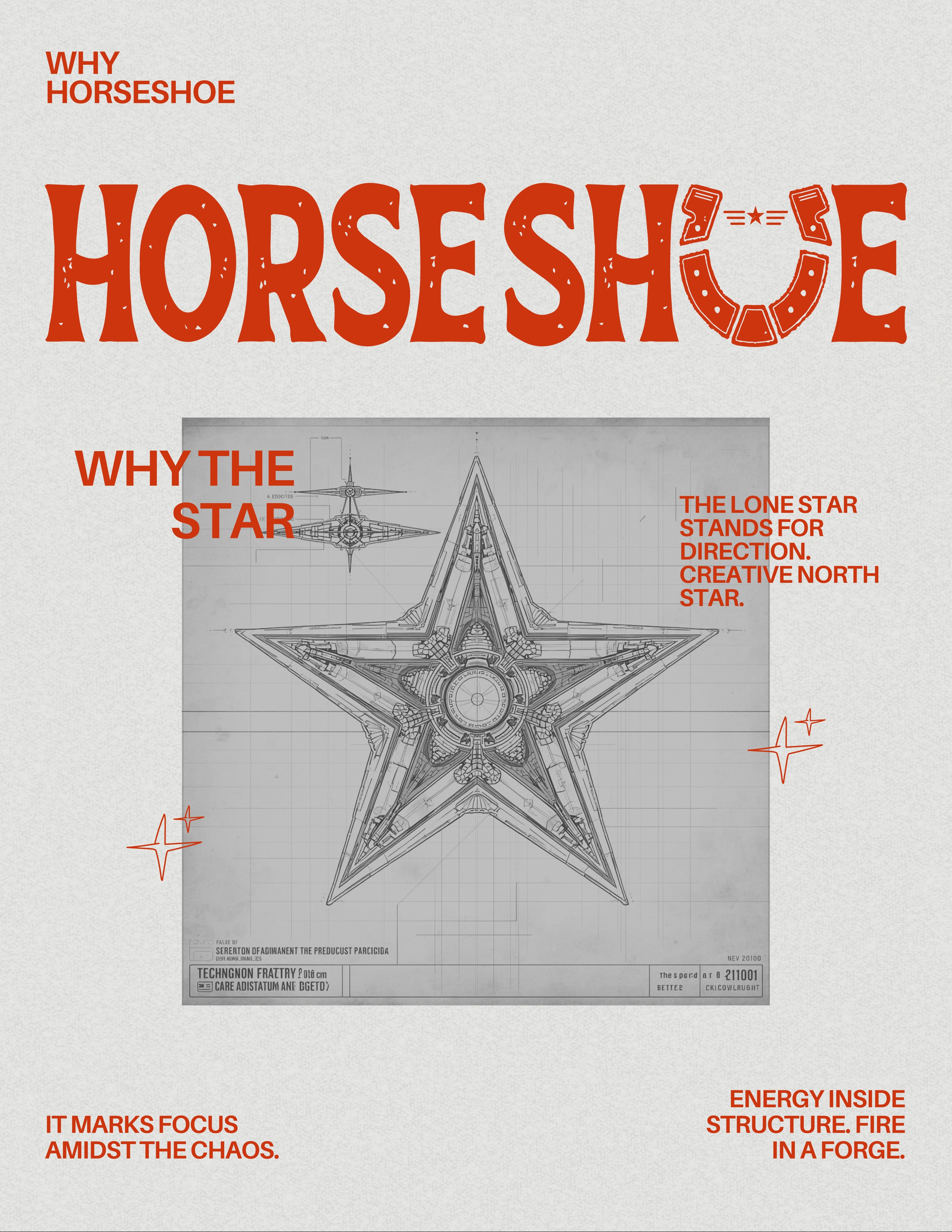
3. The Red Star at the Center
The lone star stands for direction—a kind of creative North Star. It marks focus amidst the chaos. Energy inside structure. Fire in a forge.
4. The Arc of Motion
The circular arrangement of horseshoe elements subtly mimics the rhythm of movement. After all, a horseshoe only makes sense in motion. It’s a reminder that our work isn’t static; it evolves, iterates, and travels with the brands we build.
5. Balance of Tradition and Modernity
The logo isn’t vintage for nostalgia’s sake. It’s a reminder that craftsmanship still matters—even in digital worlds. A pixel and a hammer swing aren’t as different as they seem.
What the Name Ultimately Stands For
“The Horse Shoe Studio” is our way of saying:
• We believe in luck, but only the kind we earn by working hard.
• We honour craft, whether it’s a forged horseshoe or a design file.
• We embrace symbols because humans think in symbols.
• We like stories, especially the ones that reveal themselves slowly.
And perhaps most importantly, the name keeps us humble. Nothing pretentious—just a simple, sturdy tool that’s been around for centuries, still doing its job quietly. In a world that’s racing to be the next big thing, we chose something grounded, elemental, and reassuringly unfancy.
It makes a fitting home for the kind of work we want to put into the world.
Related Blog
other


